
Friday, 9.03pm
Sheffield, U.K.
Making every page or screen self-evident is like having good lighting in a store: it just makes everything seem better. – Steve Krug
How often have you sat through a presentation and wished to god you were somewhere else? One filled with relentless bullet points and long words – made worse by the presenter reading them to you?
I used to think all that mattered was the work. As an engineer, if I got the figures right or the model working, it didn’t really matter what the end result looked like.
The typical workflow started by spending time on a model, getting the numbers working right, making it easier to get information into the model and update it and getting rid of all the bugs.
Finally, it was time to either pdf the document or copy and paste the results into a powerpoint and the job was done. It was time to go and see the client.
I’m not sure if they looked perplexed when being taken through the presentation. They probably did – they were probably too polite to stop and say they didn’t get it.
Then I went back to business school and realized that getting the numbers and analysis right is only one part of what needs to be done.
The bigger part is getting people to do what you want. It doesn’t matter how good your analysis is if you can’t persuade the people listening to you to take the next step, whatever it is.
This is a mistake many of us have made. And a big part of it is because we’ve never been taught how to design presentations that work.
There’s two parts to a presentation that works – the story you tell and the way it looks.
In a previous post I wrote about how to create a story for your presentation. Now it’s time to think about how to design your presentation.
A great book to get started is Robin Williams The Non-Designer’s Design Book. She writes that most people can look at a page and know they don’t like it. What they don’t know is how to fix it.
The secret is to learn four key design concepts and, if you get them, you can make every presentation looks much more professional and impressive.
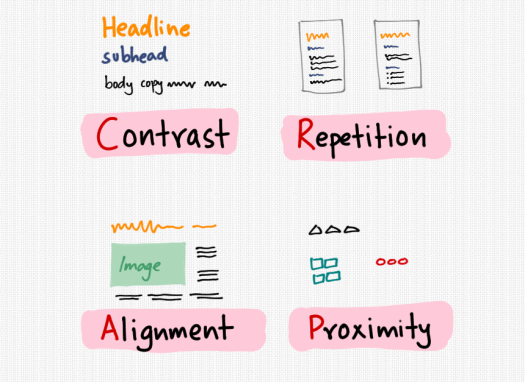
First – understand how to use contrast
You are probably fairly comfortable with the default presentation templates in software like Powerpoint. You have a headline and body text. You might have images. You may put in some smart art or text boxes or diagrams.
In other words, you have lots of elements on your page. What should you do with them?
Imagine having a document set entirely in capital letters in the same font and text size. That’s going to be painful to read.
What you should do is make each element on the page distinctive. Headlines should be bigger than subheads, which in turn are bigger than body text.
Images should be clear and stand out from the page background. Having a busy background will make it harder to see an image or annotation.
If you make things that are different look different, you can draw attention to what you want. For example, you might have a table with lots of numbers, but you can make the result you want to draw attention to stand out by increasing its size or colour.
Next – use repetition to set expectations
Your audience or readers will look for clues to tell them what things mean. If you have a headline in orange in one page and then use the same colour and size for body copy or an image caption, you’re going to confuse and anger them.
Keep things consistent. Use the same fonts and sizes for similar pieces of content across different pages. If you use a quote or highlight something in a box, make sure the same kind of box is shown on other pages – because you’ve trained your audience to expect something specific the first few times the box came up.
The beauty of using elements that repeat is that as people get used to your material, they’ll fill in the blanks for you. If they know that you make a statement followed by an example, they’ll start to wait for your example before they make a decision on your statement.
Alignment just makes everything look better
The simplest secret of graphic designers that we all miss is that they make things look good just by lining everything up nicely.
It’s like going into a supermarket. If you look at a shelf and everything is neat and tidy it looks good. If you’re at the sale section and everything that’s going off has simply been dumped on the shelves it looks like it is – cheap and out of date.
You can get this effect simply by aligning your text and images so that the line up. You know this is happening when it looks like there is a box around your content. Take the example in the picture above – just by aligning the image on the left and the text on the right with the width of the headline, it looks neater and more consistent.
Finally use proximity to keep related things together
This simply means that if you have items that are similar, keep them together and separate from other elements. For example, if you have input parameters, analysis and results in a spreadsheet, chunk them up and show them separately. That way your audience can take each one in turn rather than having to figure out what is what.
A good example of this is how you set out features, proof and a call to action on a page. You might have a bulleted list of features, a case study with a photo of someone who has used your services and information on how to get in touch with you.
You’ll get a much better response if you make it clear which is which.
Design doesn’t replace content – but it can help get your message across
Something that is pretty but empty isn’t going to help you sell. The chances are, however, that you know your stuff inside out. You can make a pretty good case for why your prospect should buy from you.
If your presentation looks sloppy, however, that’s going to work against you. Using these simple design rules, which can be remembered pretty easily if you create an acronym using their first letters, everything you create will look better.
And you’ll probably find that you have more prospects nodding in agreement with what you’re saying.
Cheers,
Karthik Suresh
