If you are interested in charts, there are three books that should go on your reading list.
- Understanding Variation, by Donald. J. Wheeler
- Guide to Quality Control, by Kaoru Ishikawa
- Say it with Charts, by Gene Zelazny
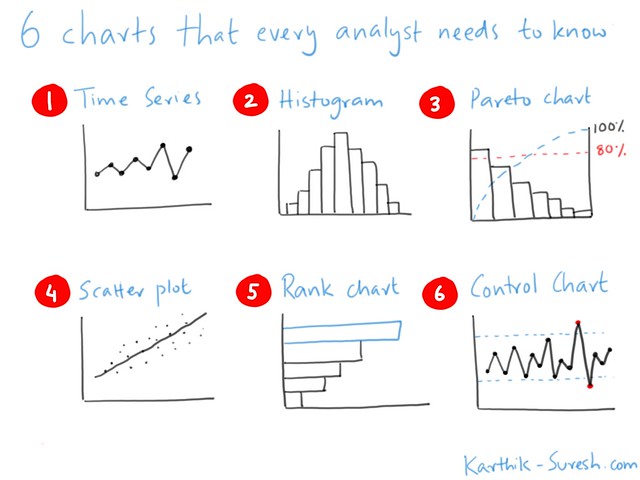
These 6 charts will help you structure the way in which you interact with data – and help you get insights in a systematic way.
1. Time Series
Much of the data you will analyse will have an order in which it was collected.
The Time Series chart is the way in which you get a first look at the data.
A simple line chart will tell you how something is changing over time. Is it:
- Going up?
- Going down?
- Remaining constant?
- Fluctuating?
This chart is the one you use when you want to talk about trends and patterns.
2. Histogram
A histogram tells you how frequently a value appears within a range.
This is the basis of the well-known “bell curve”.
In any data set, a large number of values will be close to the average.
A small number will be outliers at the lower end or the upper end of the distribution.
A histogram helps you understand the shape of the data by asking questions like:
- Does it look normal?
- Is it skewed in some way?
- Are any values isolated?
- Are there odd peaks?
- Does it fall off like a cliff?
The shape of the distribution tells you a lot what could be happening.
In energy data, a peak at the wrong time could alert you to equipment being left on.
A well-controlled system might have a sharp rise at exactly the time all your equipment is switched on.
3. Pareto chart
A Pareto chart is the basis of the “80:20” rule that says that (roughly) 80% of the effects come from 20% of the causes.
If you order the causes from largest to smallest, and draw a line that shows you the cumulative percentage, you will be able to quickly identify the factors that matter.
You can then focus on fixing the problems caused by these factors, and that will have the most impact on your operations.
For example, if you identify three pieces of faulty kit that uses most of your power and repair or replace them, you will have more impact than carrying out 20 maintenance jobs that have a small impact.
The Pareto chart helps you focus and direct your efforts on the things that really matter.
4. Scatter plot
A scatter plot shows you the relationship between two factors. Are they linked, or is there no connection between them?
The main purpose of a scatter chart is to help you understand the relationship between cause and effect.
For example, the temperature outside affects some organisations more than others.
If you have a commercial building, a cold day will probably result in you increasing your energy usage for heating.
A factory on the other hand, where most of the energy is used by process equipment may not be dependent on the weather at all.
A scatter plot will help you to identify the relationship between factors and make sure that you draw the right ideas about cause and effect.
5. Rank chart
A pie chart is almost always the wrong thing to use to show data. Instead, a rank chart gives you much more insight.
A rank chart is a bar graph, sorted so that the largest item is on the top and the smallest at the bottom.
You can draw attention to the item you want to show by highlighting it in a different colour.
This helps you show the relationship between items or between one item and the rest.
This means you can say things like:
- Things are about the same
- One thing is more or less than the others
6. Control chart
The control chart is a little used chart, but probably one of the most useful.
A control chart is created by adding two lines around a time series or run chart.
These lines are calculated by the amount of relative movement in the data, worked out using standard deviations or a similar method.
The purpose of the lines is to tell you when one of changes in value is statistically significant.
Why does this matter?
J.P Morgan, the famous American financier, was once asked what he thought the stock market would do today.
His answer – “It will fluctuate”.
Values go up and down. Too many people think they have to explain every variation, but this is hardly ever useful.
The thing you need to figure out is which bits of the series is noise, where values are simply fluctuating like they did in the past and will do in the future, and which bits are signal – indicatnig something different is happening.
The control chart gives you a way to do that.
When the line chart goes above or below one of the control lines, something significant has happened.
For example, in a manufacturing process, perhaps something was moved unexpectedly, or a fault occurred and the power went off.
A control chart lets you only act when you need to – and lets the “voice of the process” tell you when something is happening that is unusual and needs to be looked at in more detail.
Summary
These charts can be used in the following ways:
- Time series charts to understand the trends in the data.
- Histograms to understand the shape of the data – is it normal or is something odd going on?
- Pareto charts to focus on the things that matter.
- Scatter plots to connect cause and effect.
- Rank charts to compare items with others.
- Control charts so you can take action only when something significant happens.
There are more references in the books mentioned at the start of this post, but mastering these 6 charts is a first step towards carrying out good data analysis.